From the brief and competitor analysis to page structure, concept, section content, script, and requirements for photos, videos, and content.
The JobStudio case study on how to combine a premium presentation, a clear selection of services, and a seamless customer journey to booking.
A salon’s website may look expensive, but it can still be user-unfriendly. A large video grabs attention, photos set the mood, and the brand story adds prestige. But if a visitor doesn’t understand what services are offered, who to trust with their hair, or how to make an appointment, the visual presentation doesn’t solve the business problem.
Table of Contents
This is exactly what we focused on in the Frédéric Moreno Bratislava project. We needed to convey the brand’s French origins, showcase the salon’s high standards, and at the same time, not make it difficult for new customers to visit.
Where We Started: The Brief and Initial Data
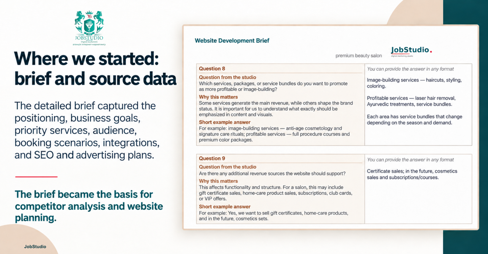
We didn’t start working on the website with its structure or design, but rather with a detailed brief. The client described the salon’s positioning, business goals, priority services, target audience, visual style requirements, booking scenarios, necessary integrations, and plans for SEO and advertising.
The responses made it clear that the website should not only showcase the brand but also increase the number of online appointments, familiarize visitors with all of the salon’s services, promote the sale of gift certificates and service packages, and highlight the loyalty program and special offers.
Trust your business development to certified professionals!
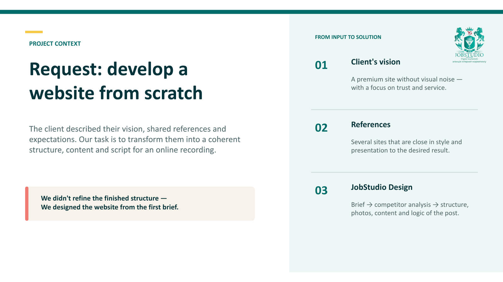
The client also provided several reference websites and explained how they envisioned the final design: a clean, premium look, plenty of white space, vibrant photos, and no visual clutter. These responses served as the basis for competitor analysis and the subsequent website design.
Objective: to showcase the salon’s quality and make the choice easier
Frédéric Moreno is a salon in Bratislava with a French brand heritage. It was important to convey this context without making empty promises about “exceptional quality” or “impeccable service.”
A new visitor needed to quickly find answers to practical questions: what services are available, which professionals provide them, what the results look like, what happens during the first visit, and how to make an appointment.
That’s why we viewed the page not as a presentation of the salon, but as a series of decisions that help a person make a choice.
How We Worked on the Project
First, the team gathered information about the brand, its services, its stylists, and its appointment policies. We checked which materials were already available for use and which photos, videos, and texts still needed to be prepared.
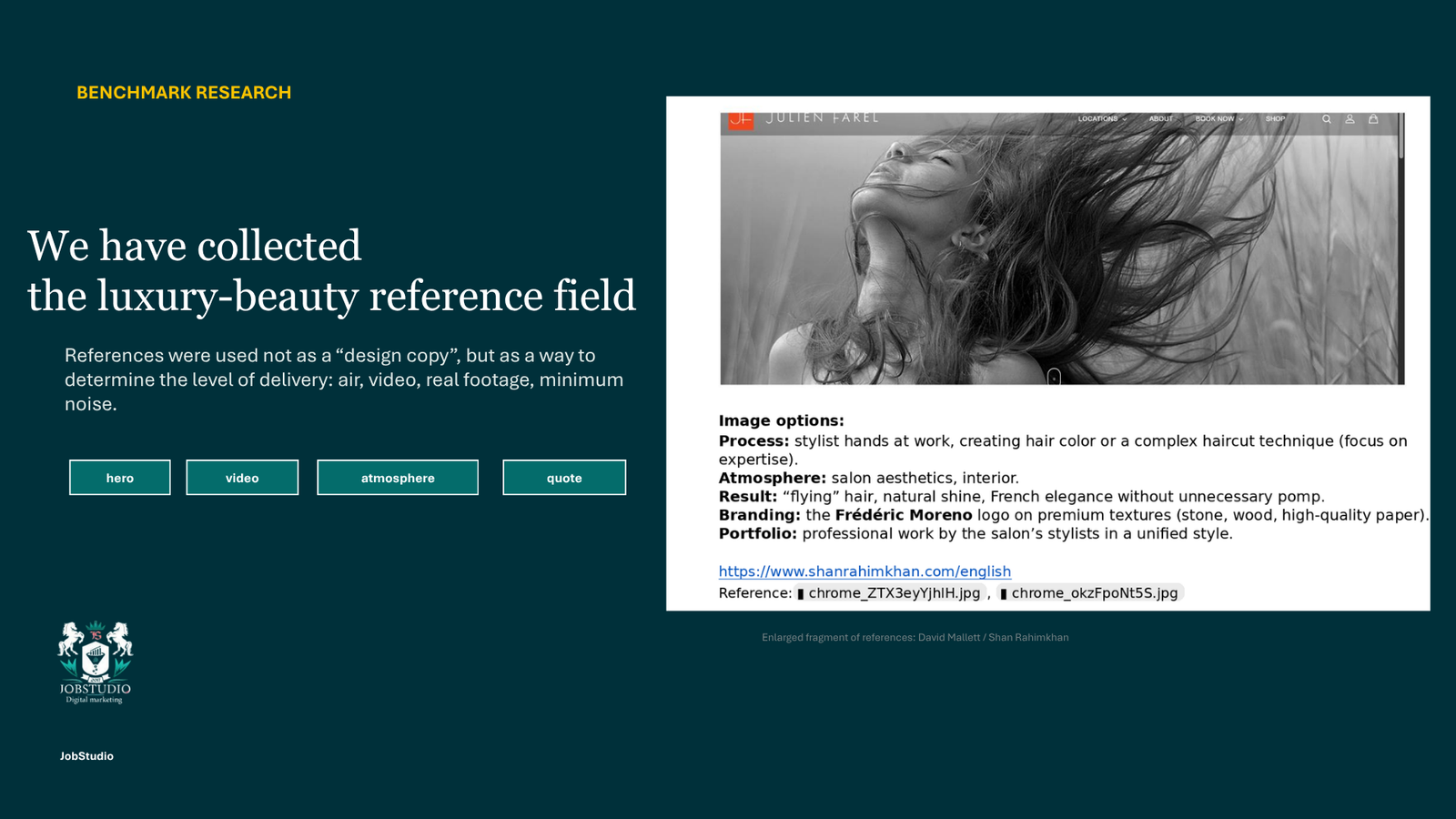
Next, we analyzed the websites of salons and beauty brands in the premium segment. We didn’t just compare their visual design. We looked at how they describe their services, introduce their team, showcase their work, and post updates.
Analyzing competitors did not mean copying their design, structure, or content. We viewed websites as a source of individual ideas and assessed how well they aligned with Frédéric Moreno Bratislava’s objectives. We reimagined, expanded upon, and adapted successful features—such as short videos, stylist profiles, or a concise brand story—to align with the salon’s positioning, services, and customer journey.
We rejected some of the solutions: they were outdated, made the page too cluttered, or didn’t help the client navigate to the post. We proposed other blocks and scenarios on our own, based on the answers in the brief, the audience’s characteristics, and the business objectives. As a result, the final structure did not replicate any of the reference designs—it was developed specifically for this project.
After conducting the research, we defined the role of each section and prepared the content, headings, and requirements for visual materials.
Stop “draining” your budget, call in the experts!
.
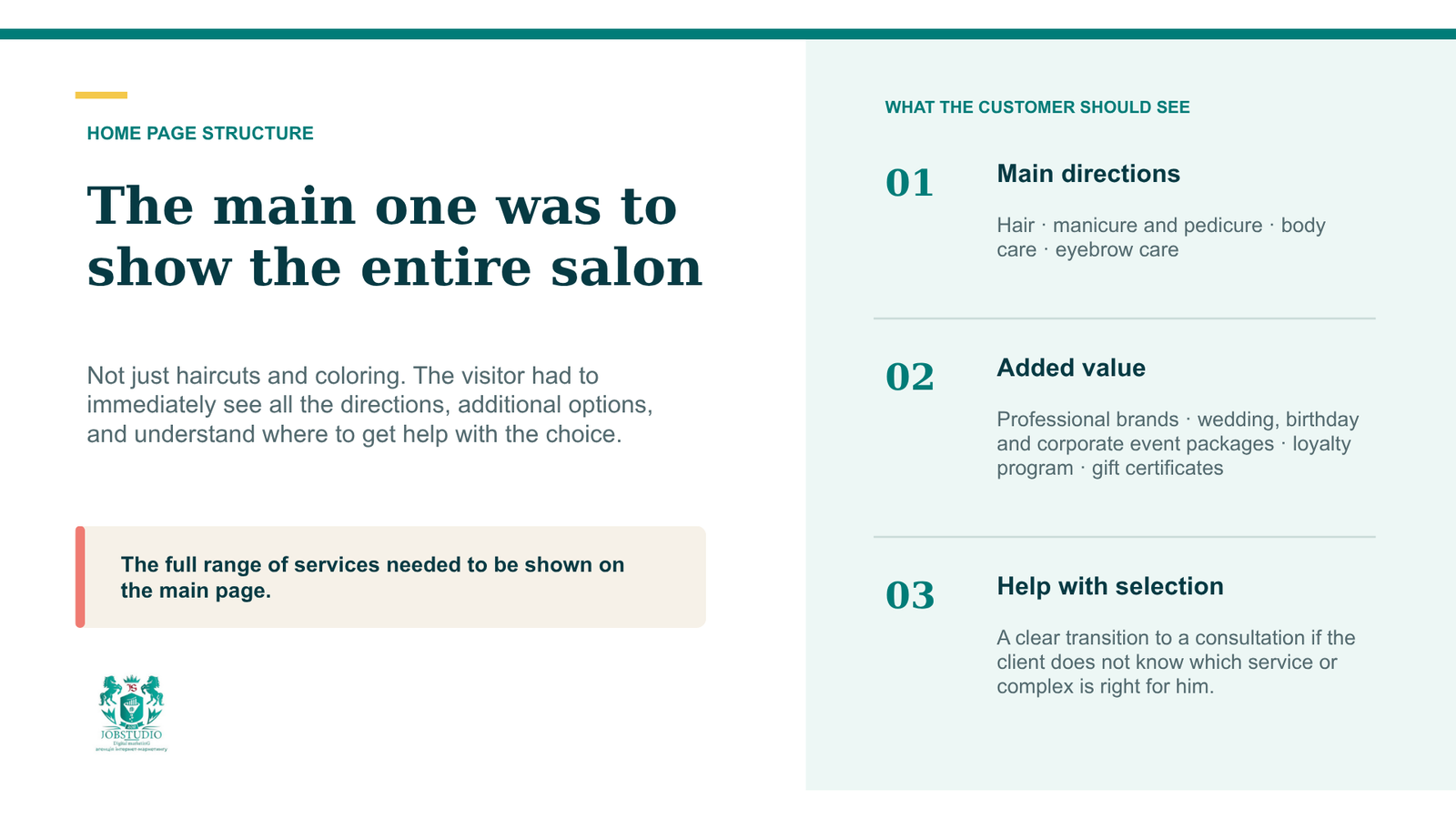
The homepage was meant to show that Frédéric Moreno is more than just a hair salon. In addition to haircuts, coloring, and hair care, the salon offers manicures and pedicures, body and eyebrow care, as well as special service packages for weddings, birthdays, and business events.
We needed to present professional products from well-known brands, our loyalty program, and gift certificates in separate sections. For visitors who aren’t sure which service or package to choose, we’ve made it possible for them to get advice.
That’s why the homepage was designed to serve as a comprehensive guide to the salon’s services: from learning about the different treatments and additional offerings to scheduling consultations and appointments.
Results of the preparatory phase—by the numbers
We have prepared a 34-page working document. It includes a structure consisting of 12 main sections, four options for the home page, recommendations regarding photos and videos, the presentation of professionals, services, portfolios, the first visit, certifications, professional tools, and FAQs.
The document was intended to serve as a common foundation for the client, the designer, and the developer. Instead of vague requests like “make it look premium,” the team received a concrete blueprint for the future page.
First, the customer journey; then, the design
The user should be able to navigate the page without unnecessary detours. First, they see the brand, city, and specialty. Then they learn about the salon, the stylists, and their work. After that, they find out what to expect during a visit and proceed to make an appointment.
We’ve created a simple process: first impression → trust → choice → sign-up.
This approach helped us determine the order of the blocks and eliminate solutions that looked impressive but didn’t help the client.
How We Built the Home Page
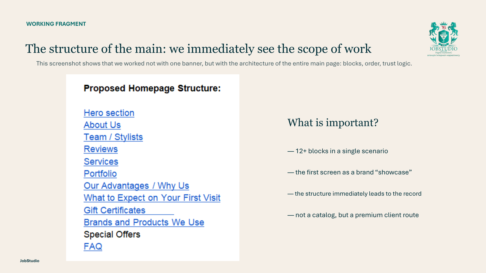
The structure includes:
first screen,
Information about the salon,
team, reviews,
services, portfolio,
advantages,
description of the first visit,
gift certificates,
brands and materials,
Special Offers
and FAQs.
The first sections were meant to explain our positioning. “Experts,” “Services,” and “Portfolio” were meant to provide evidence. “First Visit” and “FAQ” were meant to clear up any uncertainty before booking an appointment.
Thanks to this approach, the page doesn’t turn into a catalog of all the salon’s services. Instead, it gradually guides the visitor toward a decision.
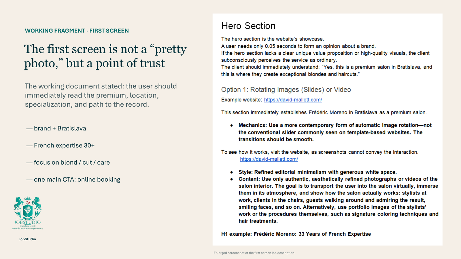
The First Screen: What You Need to Explain Right Away
We compared four formats: a static photo, a slideshow, a full-screen visual block, and a video cover. Each option had its own advantages, so we evaluated more than just aesthetics.
We checked whether the headline was legible, whether the record button was visible, how the module would work on a smartphone, and whether the image distracted from the main point.
Get a responsible approach in promoting client project. Contact us now!
Get a development plan your site!
Let’s clarify over the phone the purpose and objectives of the site
Get a consultation
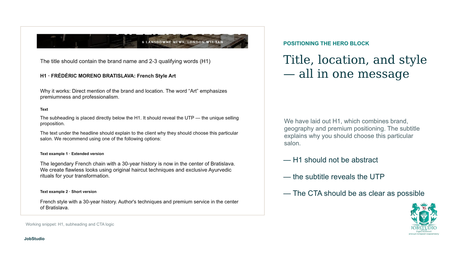
The first screen was supposed to include three elements: the brand name and city, a brief description of the specialty, and a clear “Sign Up” button.
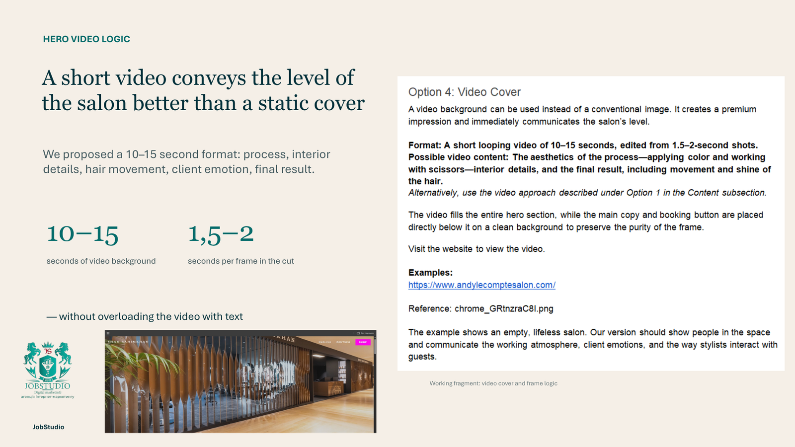
For the video, we proposed a short, looping montage lasting 10–15 seconds. The footage could include scenes of cutting with scissors, applying paint, interior details, and the finished result. Each clip was to last approximately 1.5–2 seconds.
It was important to show not an empty interior, but a lively salon: stylists at work, clients, and the interaction between them.
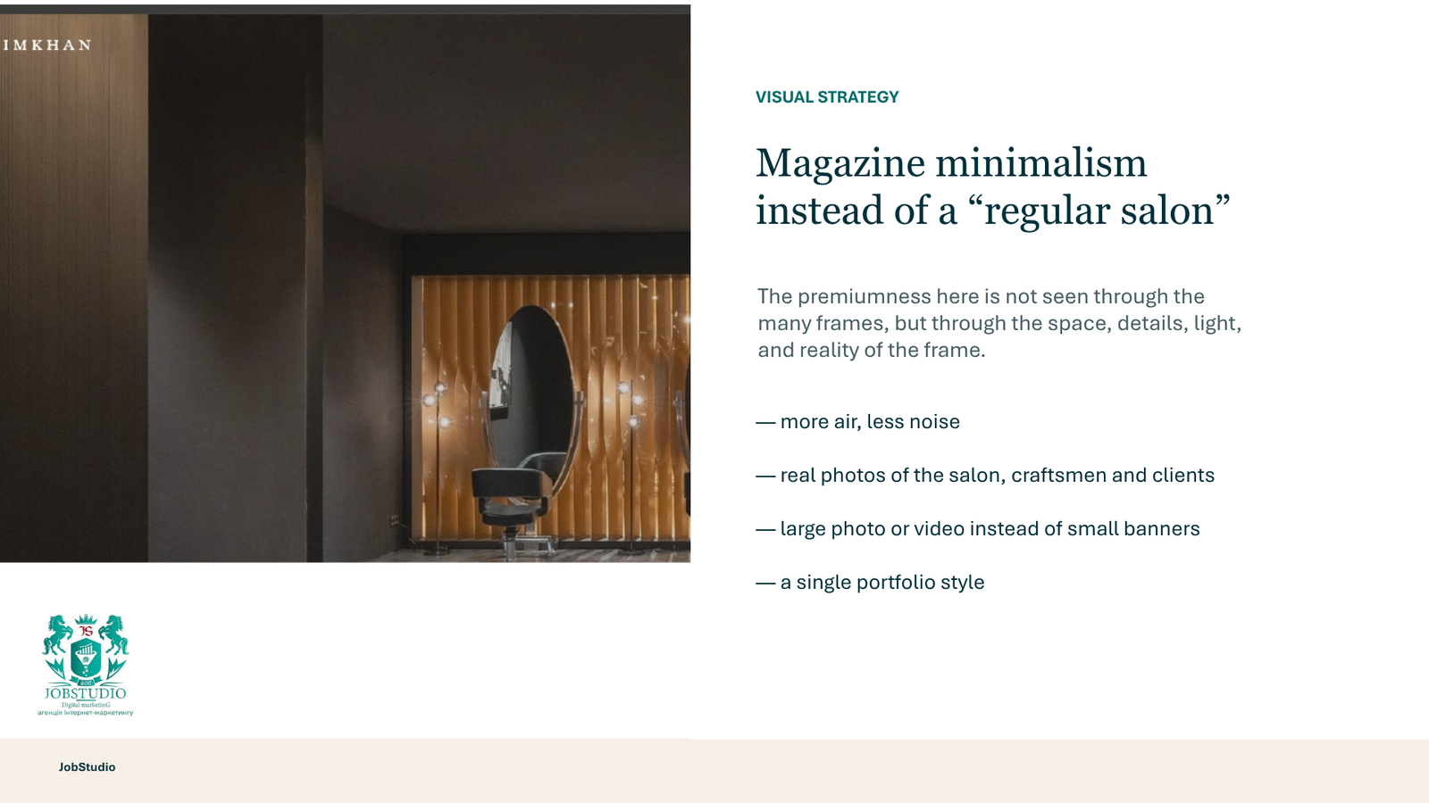
Visual concept: a premium look without unnecessary embellishments
In the beauty sector, brands often try to convey a sense of luxury through gold accents, intricate backgrounds, and decorative fonts. We opted for a more understated approach: large photographs, clean typography, white space, and a consistent layout.
The foundation was to be based on actual materials from the salon. We divided them into five groups: workflow, atmosphere, results, branding, and portfolio.
The process requires close-ups of the stylist’s hands during haircuts or coloring. The atmosphere is conveyed through the interior and candid shots with clients. It’s best to showcase the result through the movement, shine, and texture of the hair, rather than just a static portrait.
This approach helps you plan photo shoots for specific sections of the website, rather than just collecting random, attractive photos.
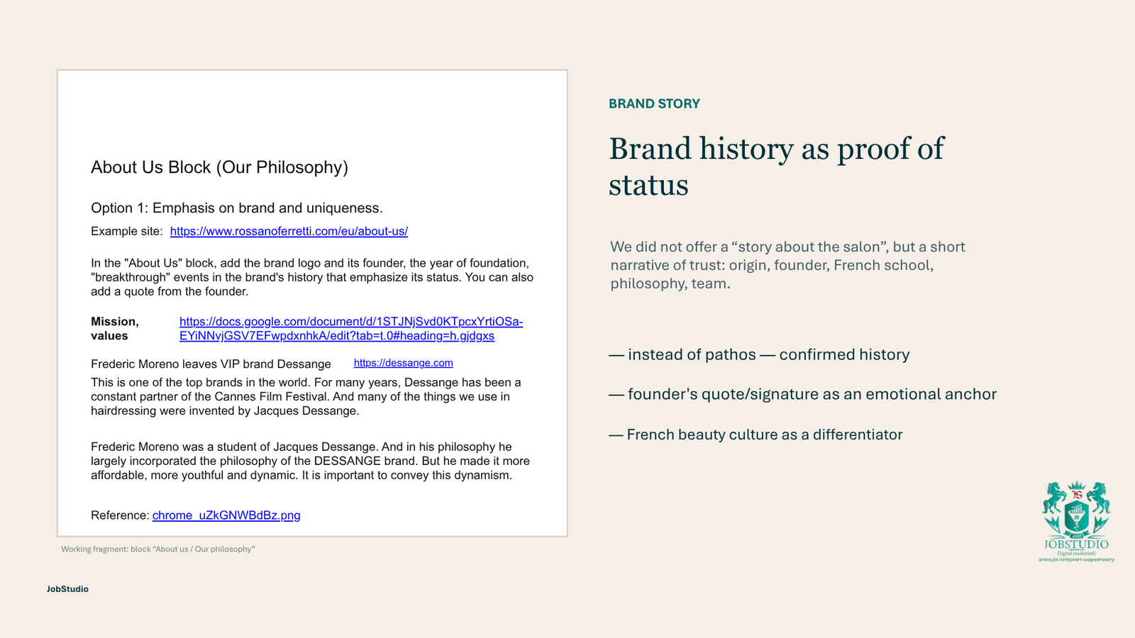
How We Brought the Brand’s Story to Life on the Website
Frédéric Moreno’s story from France could have strengthened our positioning, but a long text on the home page would have distracted from our services.
So we proposed a brief section featuring the logo, key facts, important dates, a photo of the founder, and a quote. The working materials also included a video presentation of the salon and the brand’s signature.
Get a free consultation
Fill out the form and our managers will consult you today
The story wasn’t just meant to recount the past. It was meant to explain how the brand’s origins are reflected in its approach to haircuts, coloring, and hair care today.
We advised against including unverified historical claims in the final text. For this section, accuracy is more important than dramatic wording.
Professionals, Services, and Portfolios: How to Help a Client Make a Choice
A salon client doesn’t just choose a brand or a service. They choose a professional whom they will trust with their look and the desired result.
That’s why we decided to include each specialist’s profile with their area of expertise, the services in which they have the most experience, their category, work experience, examples of their work, and a booking button. Next to the category, we included a brief explanation in a pop-up window: what the “master” level means and the criteria used to determine it. This helps visitors understand a specific specialist’s strengths, how the categories differ, and who is best suited for their needs.
We looked specifically at candid “artist-client” photos. They convey the rapport and atmosphere better than identical team portraits against a neutral background.
Want to surprise your competitors with results?
We will study your site and form a development plan
.
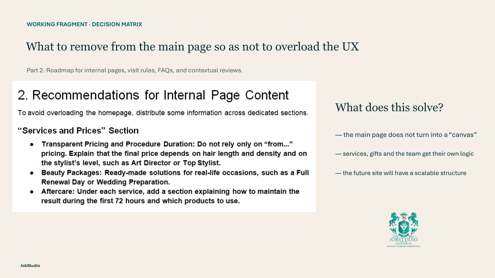
For each service, we’ve included a brief description, a list of what the procedure entails, and a price starting with “from.” This way, clients understand what the service entails even before making an appointment and can get a sense of the cost.
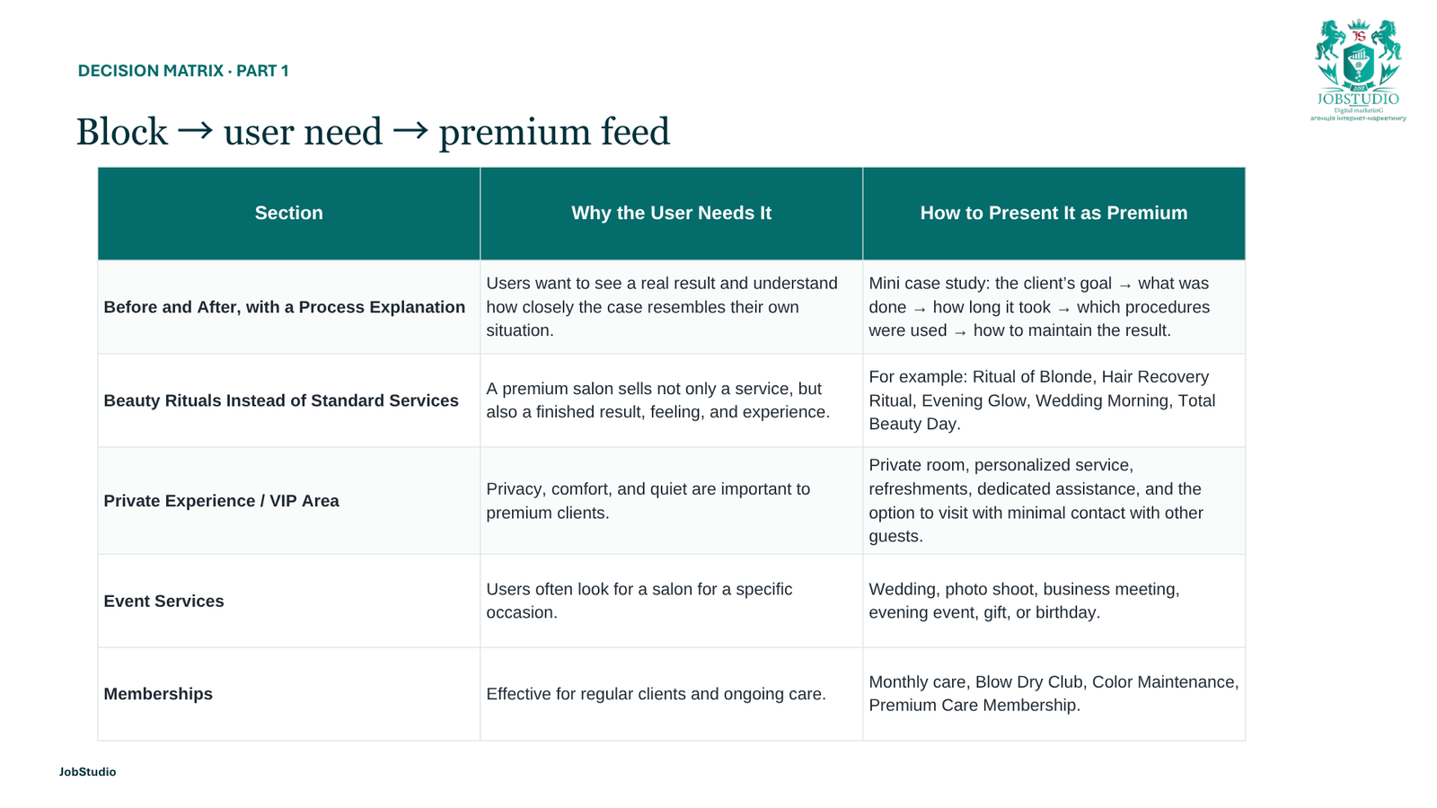
We suggested organizing the portfolio into categories. You can include a “before and after” format, a brief description of the project, and the artist’s name with each piece. This way, the photograph serves as proof of their experience, rather than just being part of a gallery.
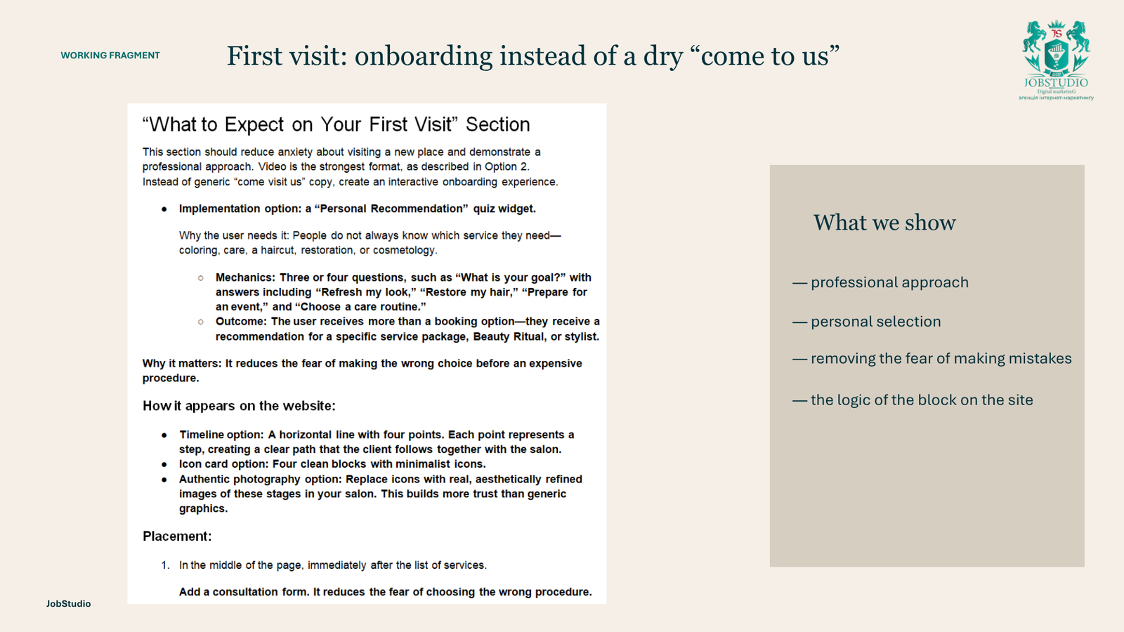
How We Cleared Up the Uncertainty Before the First Visit
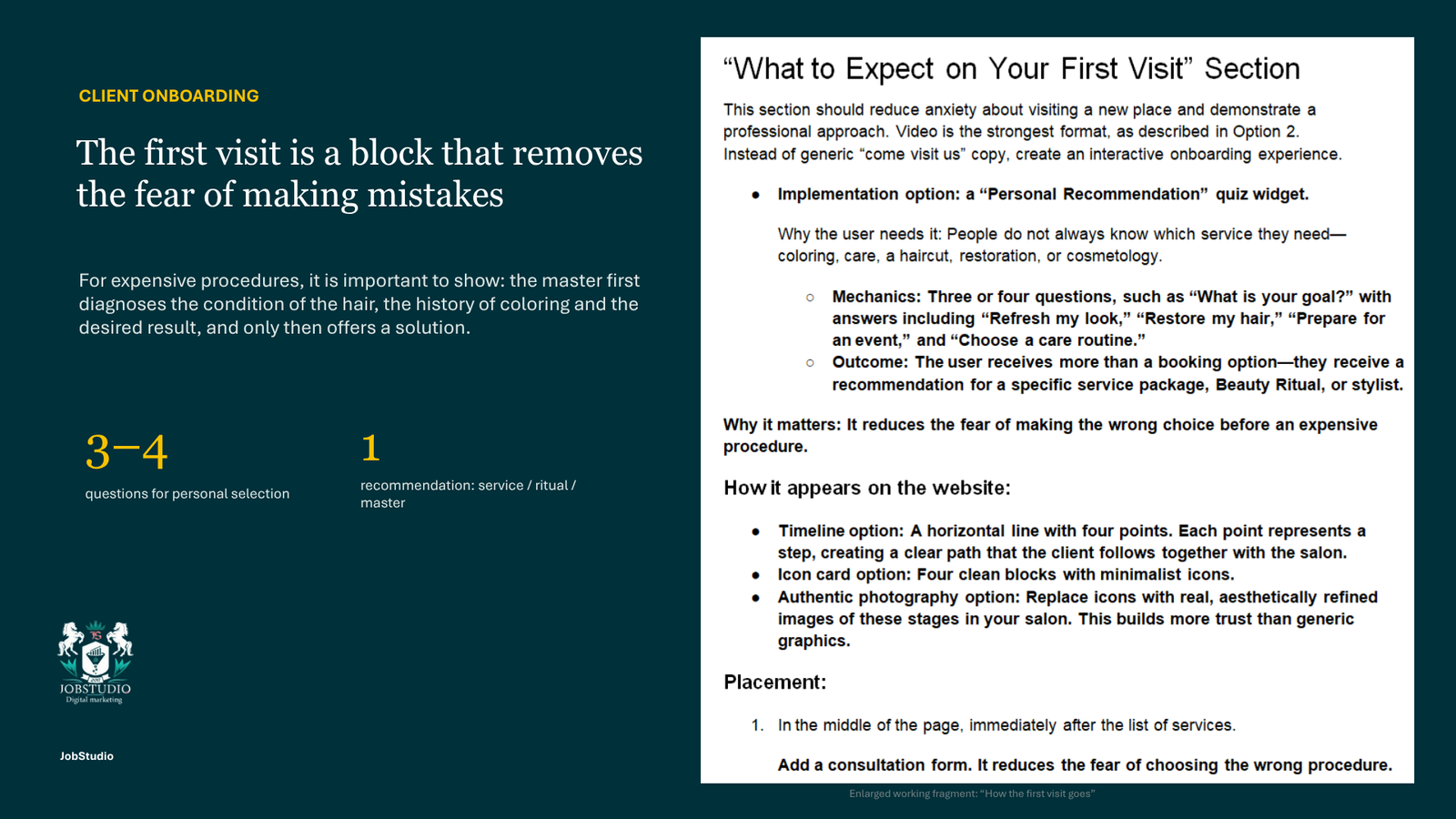
A person may put off making an appointment if they are unsure which procedure to choose, how much time to set aside, and how much the service costs.
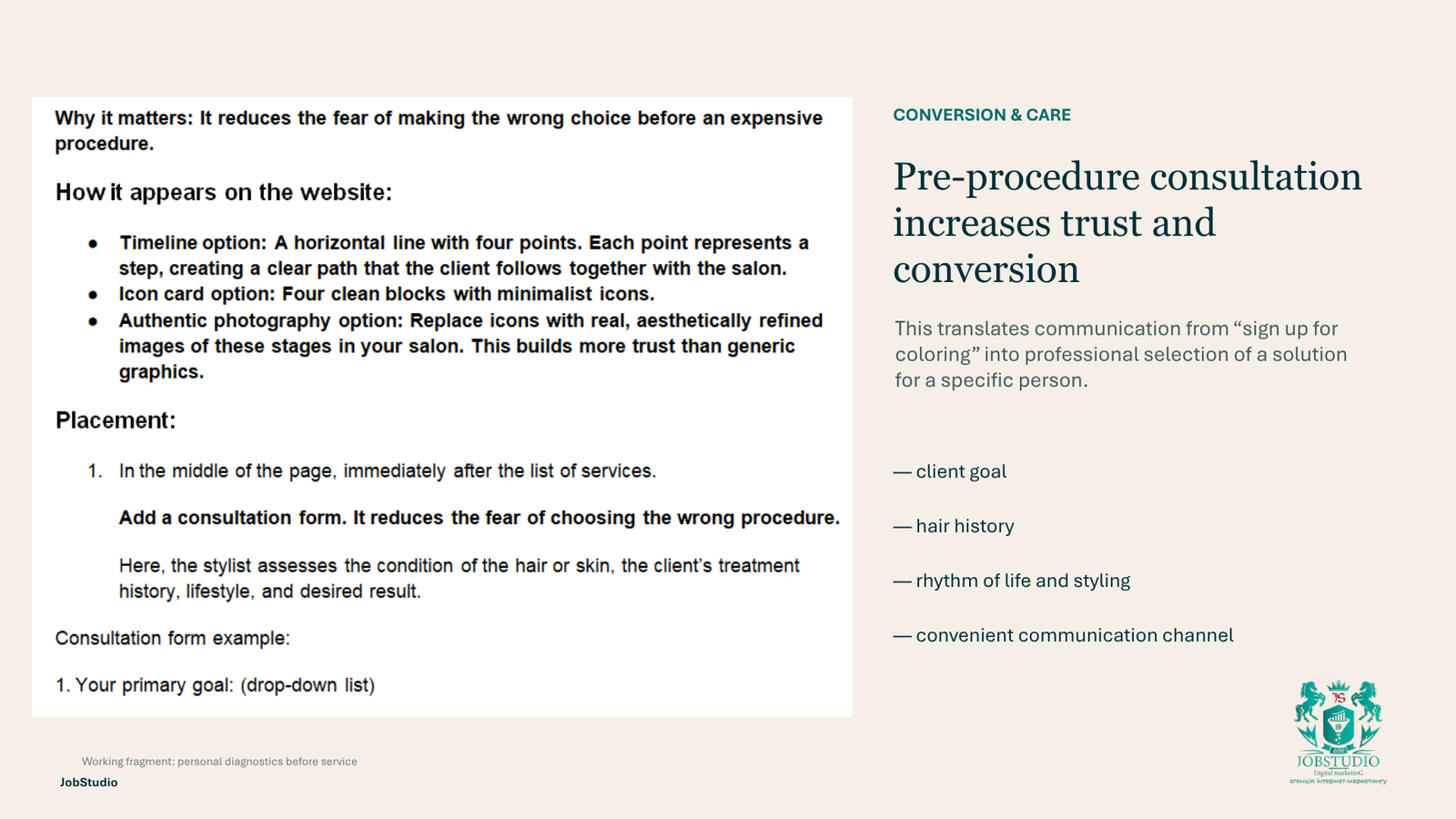
To that end, we suggested breaking down the process of the first visit into separate steps: a consultation, a hair assessment, a discussion of the desired result, agreement on the service, time, and cost, the stylist’s work, and recommendations for at-home care.
This section prepares the client for the visit and reduces the number of basic follow-up questions the administrator needs to ask.
Want to know if your website has errors?
We will study your site and form a development plan
.
Reviews and FAQs: How to Clear Up Any Doubts Before Signing Up
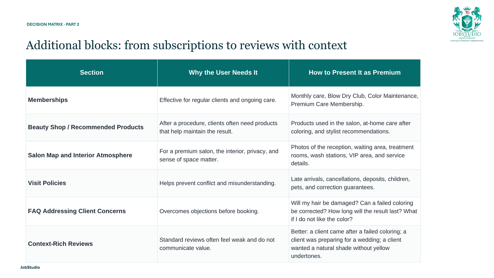
We suggested moving the reviews into a separate section and displaying them not as a set of general ratings, but as short stories with context: what the customer’s request was, which service they chose, and what result they received. This way, reviews serve as proof of the quality of our work and help new visitors find an example similar to their own situation. We also designed the FAQ section as a separate section. It contains practical questions that arise before making an appointment: how to choose a service or specialist, whether a preliminary consultation is needed, how pricing is determined, how to prepare for the visit, and what to do in case of a delay or cancellation. This reduces uncertainty for the client and the number of repetitive inquiries to the administrator.
How the website drives additional sales and repeat visits
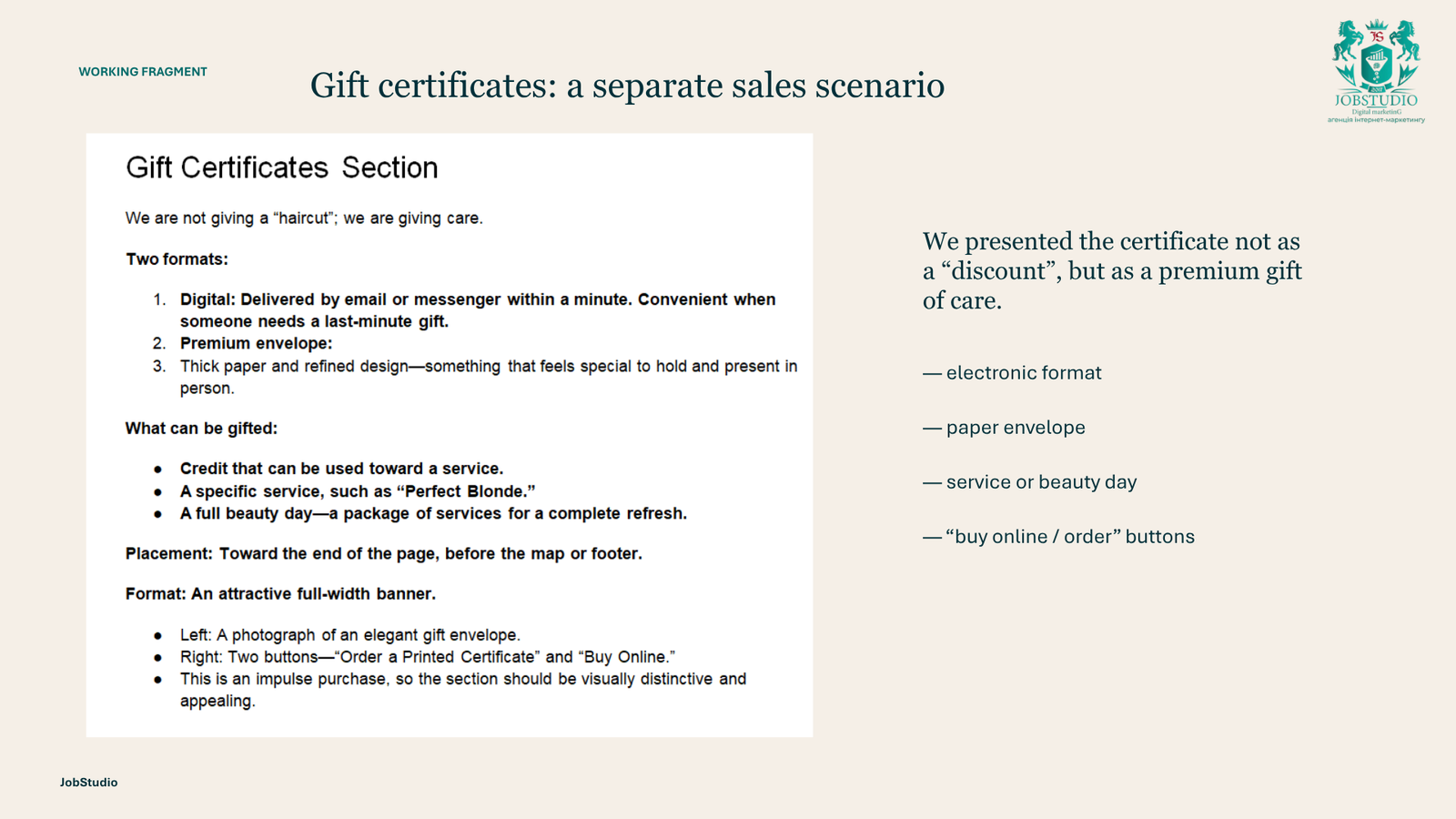
We paid special attention to gift certificates. We’ve made it possible to choose an amount or a specific service, the gift certificate’s format, and the packaging, and then proceed directly to checkout without lengthy back-and-forth with an administrator. This is convenient for anyone who wants to plan a birthday surprise or give a gift to a loved one.
We’ve also included a section dedicated to the loyalty program. By scanning the QR code on the website, customers can download the mobile app and join the loyalty program. Through the app, they’ll receive special offers, personalized discounts, and the latest news from the salon. This way, the website helps not only attract new customers but also bring back those who have already visited the salon.
For special offers, we do not recommend structuring your promotion around a fixed “-30%” discount. A premium salon is better suited to seasonal packages, skincare rituals, a complimentary gift with a treatment, or a special offer for first-time visitors.
We’ve also included a section dedicated to the loyalty program. By scanning the QR code on the website, customers can download the mobile app and join the loyalty program. Through the app, they’ll receive special offers, personalized discounts, and the latest news from the salon. This way, the website helps not only attract new customers but also bring back those who have already visited the salon.
Professional cosmetics used by the salon
We’ve grouped the skincare brands into a separate section. Instead of simply listing logos, we decided to provide a brief description of each brand, explain which treatments use its products, and explain why the salon team chose these particular products.
This display highlights the quality of the products used by the specialists, reinforces the salon’s premium positioning, and helps clients understand which cosmetics will be used during the treatment.
What We’ve Prepared for Local SEO
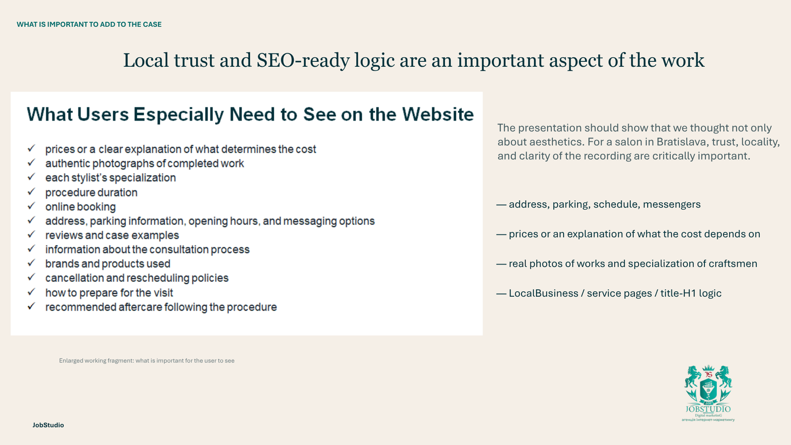
At the structural level, we linked the brand to Bratislava and provided separate sections for services, experts, the portfolio, contact information, and FAQs.
This framework can later be expanded to include pages detailing key procedures, specialist profiles, job descriptions, a map, a schedule, and localized texts.
That was the foundation for SEO. The results can only be measured after the website goes live.
What the client received and what the business benefit is
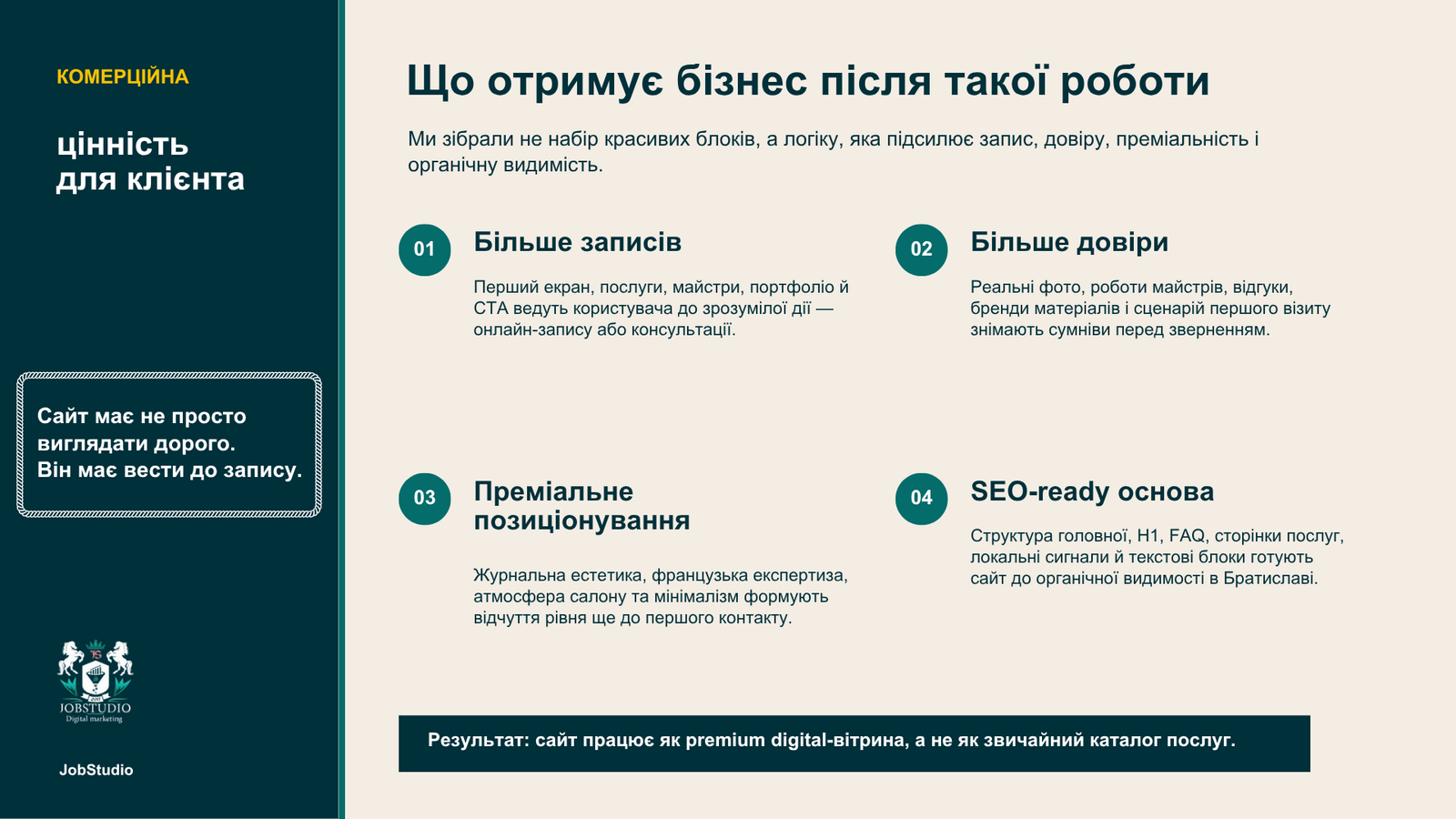
The client received a ready-made framework for design and development: page structure, block content, copywriting guidelines, and requirements for visual materials.
For the team, this meant fewer conflicting interpretations and a faster transition to mockups. For the salon, it meant a clearer presentation of services, stylists, and the first visit.
Visitors see more information before speaking with an administrator. They can evaluate the work, choose a specialist, and figure out the next step. The structure also leaves room for the local search feature to evolve after launch.
Why This Is an Example of JobStudio’s Boutique Approach
The team conducted a separate analysis of the brand, services, the new customer’s behavior, and relevant solutions in the premium beauty segment.
For us, a boutique approach means taking on fewer projects at a time and diving deeper into each one. At the same time, we don’t include everything we find during our analysis on the website. Part of the job is to weed out the unnecessary and keep only what helps the business communicate its value.
FAQ
What did JobStudio do on this project?
We started with a brief: we documented the client’s vision, the website’s goals, and the provided references. Then we analyzed the competition and built the homepage structure from scratch, defining the content for each section, the service selection process, and the customer’s path to booking.
We carefully planned the presentation of all the salon’s services: hair care, manicures and pedicures, body care, and eyebrow care, as well as service packages for weddings, birthdays, and business events. We developed the structure for the specialists’ profiles, including explanations of their categories, portfolios, pre-booking consultations, first-visit information, reviews, and FAQs.
We also designed separate sections for gift certificates, loyalty programs, and professional cosmetics brands. We prepared design options for the landing page, provided recommendations for text, photos, and videos, and laid the groundwork for future local SEO.
Was JobStudio responsible for the design and development of the website?
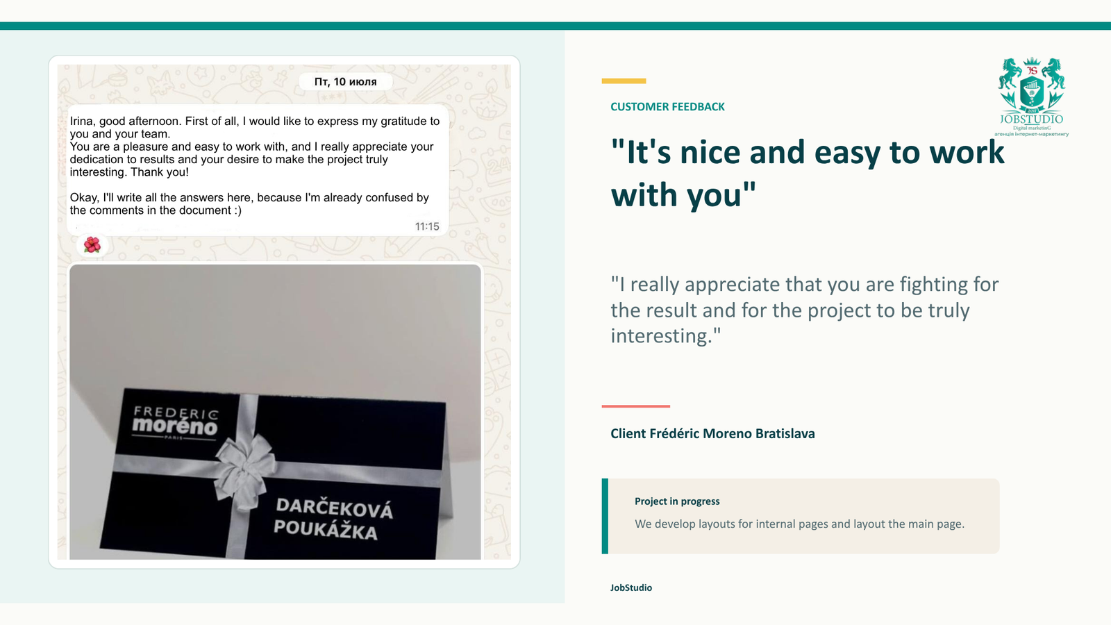
Yes. The JobStudio team handled all aspects of the website: from competitor analysis, structuring the site, creating content blocks and user interaction scenarios, to designing layouts, page layout, and technical implementation. The design is already complete, and development of the website is ongoing.
How did we develop the structure of the future website?
First, we reviewed the brief, the client’s vision, and the references they provided. Then we analyzed the competition and the new visitor’s journey: what they need to understand about the salon, what doubts they might have, and what information would help them choose a service and a specialist. Based on this, we determined the composition and sequence of the sections, and only then moved on to the design.
How does structure help with note-taking?
It streamlines the process. People can find a service more quickly, view profiles of service providers, evaluate their work, and understand what to expect during the first visit.
Did we take SEO into account?
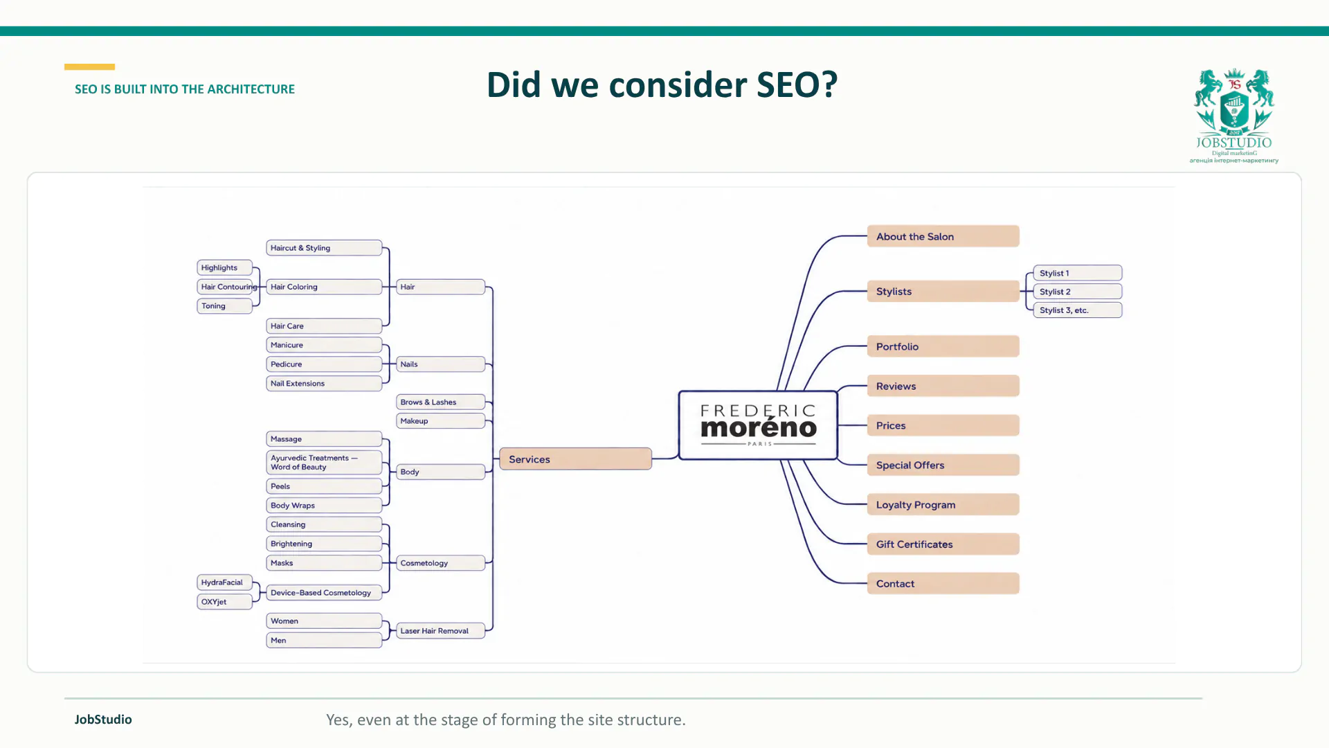
Yes. SEO was taken into account as early as the website structure planning stage. A separate page was created for each service, and each professional has a personal profile listing their specialization, category, experience, achievements, and examples of their work. This helps verify the specialist’s qualifications and build trust before a booking is made.
We also planned separate pages for the portfolio showcasing completed projects, organized by category. Additionally, we included a link to Bratislava, contact information, a map, business hours, and an FAQ section. This site architecture lays the foundation for promotion based on local search queries, service names, and searches related to specific professionals.
What does the client receive upon completion of the work?
Once this stage is complete, the client receives not just individual ideas or a set of references, but a comprehensive model of the future website. It shows which pages need to be created, which sections should be placed on each of them, what information visitors will see, and how they will progress from learning about the salon to choosing a service, a specialist, and booking an appointment.
First and foremost, the client receives a complete site structure. It includes the home page and internal pages:
about the salon and the brand’s history;
a catalog of all programs and services;
individual service pages;
the team’s page;
artists’ personal profiles;
portfolio organized by category;
individual pages showing completed work;
information about the first visit and consultation;
gift certificates;
a loyalty program and a mobile app;
professional cosmetics brands;
customer reviews;
FAQ;
Contact information, map, and hours of operation.
For the homepage, we defined the composition and order of the main sections: the first screen, information about the salon, the team, reviews, services, portfolio, benefits, first visit, gift certificates, professional cosmetics, the loyalty program, and FAQs. For each section, we described its purpose, content, key message, and the action it should prompt the visitor to take.
The client can also see what text content will be needed for the website. This includes descriptions of the salon and the brand, services and their prices, information about each stylist’s specialization, category, experience, and achievements, an explanation of the first visit, terms for purchasing gift certificates, loyalty program rules, information about cosmetic brands, answers to frequently asked questions, and contact information.
We’ve also outlined specific requirements for the visual content. The client understands what photos and videos need to be prepared: portraits of the stylists, the process of performing treatments, results of the work, “before and after” images, the salon’s interior, waiting areas, beauty products, gift certificates, and candid shots of the specialist interacting with the client. This allows us to create a shooting plan in advance and avoids having to search for materials during the design or development phase.
Customers also benefit from well-designed scenarios for interacting with the website. Visitors can navigate from a specific service to the profile of the corresponding professional, view their work, understand their category and level of experience, get advice, or book an appointment right away. Separate workflows are provided for purchasing gift certificates and joining the loyalty program via a QR code.
From an SEO perspective, the client receives a foundation for further promotion: individual pages for services, professionals, and completed projects; local relevance to Bratislava; contact sections; maps; business hours; and FAQs. This structure allows for further optimization of the website for local search queries, procedure names, and queries related to specific specialists. As a result, the client has a clear understanding of what the future website will look like, what needs to be prepared for its content, and how individual pages and sections will work together. The designer and developer receive a coordinated foundation for their work, and the number of conflicting decisions and rework during implementation is reduced.
Conclusion
For a premium salon, a website is more than just a visual showcase. It should convey the brand’s character, showcase the full range of services, explain the differences between categories of stylists, and help clients choose a specialist for their specific needs. At the same time, the website should answer practical questions about pricing, consultations, first visits, and booking policies, as well as guide visitors toward a clear course of action.
We began work on the Frédéric Moreno Bratislava website with a brief, the client’s vision, and a competitor analysis. Based on this, we built the website’s architecture, the structure of the homepage and internal pages, the sequence of sections, and the visitor interaction scenarios from scratch.
We’ve carefully planned the presentation of all the salon’s services: hair care, manicures and pedicures, body and eyebrow care, as well as comprehensive packages for weddings, birthdays, and business events. For each service, we’ve provided a brief description, a breakdown of the procedure, and a price starting with “from.”
We can make your company a market leader by providing high-quality website promotion services.
Order a CALL–get a FREE trial period of work on your projectfor 3 days ! See for yourself the high quality of our services without any risk to your budget.
We developed the logic for the professionals’ personal pages separately. In a profile, visitors will see the professional’s area of specialization, the services in which they have the most expertise, their category, experience, achievements, and examples of their work. The meaning of each category will be explained in a pop-up window so that the client understands the difference between a professional and a top professional and can make an informed choice.
The structure also includes a portfolio organized by categories, a first-visit section, gift certificates, a loyalty program with access to a mobile app via a QR code, professional cosmetics brands, reviews, FAQs, contact information, a map, and business hours.
For each section, we defined its purpose, content, and the user’s next step. At the same time, we prepared recommendations regarding text, photos, and videos. As a result, the client understands not only what the website will look like, but also what materials need to be gathered to fully populate it.
SEO was taken into account right from the start when designing the site architecture. Separate pages were created for services, professionals, and completed projects, which can later be optimized for local search queries, specific procedures, and searches for specialists in Bratislava.
Are you planning a new website or redesigning an existing one? Send us a link and briefly describe the task. We’ll identify where the site loses credibility, makes it difficult to choose, and prevents users from proceeding to a form or booking.
Customer Review
Ready to get a selling / advertising / branding website?



 Order a call
  Get an offer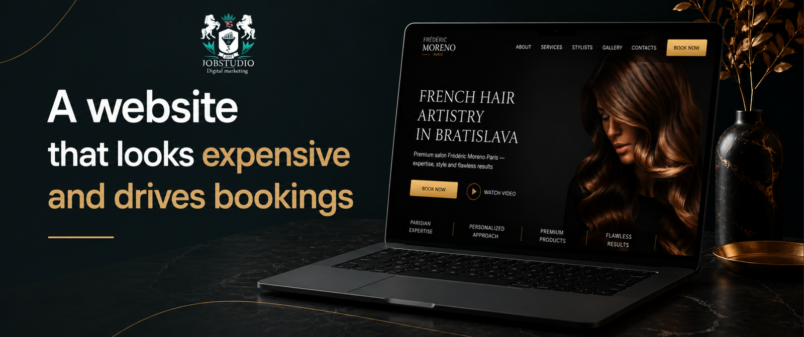


.webp)


